Thryv · Notification design case study
Alert Controls
I designed how Thryv owners turn alerts down without missing new leads.
The first email alerts could only be turned off completely. I picked up the design after a first pass, built a working prototype in Claude Code, checked what was really sending, and handed it off before build.
- Role
- Lead Product DesignerDesign, audit and coded prototypes
- Timeline
- Sep to Nov 2026About 6 weeks, through handoff
- Delivered
- Alert model and working buildBuilt in Claude Code, plus a test plan
- Handoff
- Handed off before buildThree open questions for product
The problem
Many owners learned of missed leads too late.
The first email alerts came with one control, a full opt-out, so an owner who wanted fewer emails got none, including the next lead. Inside the product, there was no way to turn anything down.
Let me choose how often I get them. Once a day is fine for summaries, but leads should always be instant.
- Earlier research and discovery
- Backend work
- The PMs' project docs
- The previous designer's documentation and first prototype
My role: Lead Product Designer, working with a PM and content design. I owned the alert model, the audit, the working build, the test plan and the handoff.
The 30-second read
I built a working prototype, then checked what was really sending.
I designed how alerts are grouped and turned down, and built the whole prototype myself in Claude Code. Then I checked the tracker and the planning board and found only 3 of 10 lead sources were sending, so I asked product to decide which phase the design was for before build.
Most owners want email, and a text for critical alerts.
Overall, 90% of owners wanted email. For critical alerts, 82% wanted a text. That matches the requirements, which set channel and timing for each type, right from the alert.
Walkthrough · 22 seconds
It follows one owner turning missed calls down to a daily summary.
Research
A survey of 49 owners showed which alerts they can't afford to miss.
The survey came from earlier discovery work. I used its answers to set which alerts are urgent by default.
Owners sort alerts by what it costs to miss them.
New leads and negative reviews topped the list, and about eight in ten rated setting urgency levels and allowing after-hours emergency alerts high or critical.
If it costs me money to miss it, it's critical. If it's just information, it can wait.
88%rated them criticalof 49 owners
- In the design
- Lead alerts sit in Needs you and arrive as they happen by default.
86%rated them criticalof 49 owners
- In the design
- My working build moved low ratings into Needs you. Good reviews stay in What's working.
71%rated it critical or highof 49 owners
- In the design
- Nothing confirms it yet. It is the gap I flagged at handoff.
From one unmoderated survey of 49 U.S. small business owners, run by a PM and a UX researcher before I joined. I re-read it against the design questions. No usability or comprehension test ran on this design.
- 01
Owners should decide what counts as urgent.
Urgent was not always the lead. One owner wanted problems with something they had sold ahead of new interest, and the requirements said owners must be able to override default urgency. I made urgency one visual signal, separate from unread, that any type can carry. Letting owners set it themselves is not built yet.
- 02
Owners asked for simple controls.
About two-thirds wanted control over when and how often alerts arrive, but they kept asking for it to stay simple. I designed three quick setups and one quiet-hours schedule that urgent and required alerts always get through. The 40% who wanted to pick those exceptions themselves are not served yet.
- 03
The two survey results agree once you split them by urgency.
The requirements and the survey's final report seemed to disagree on channels, and the team had treated it as a data problem. Side by side, they show that the channel an owner wants depends on how urgent the alert is, so the design lets owners pick the channel for each type.
Bump chart of the same 49-owner survey read two ways. Overall, with more than one answer allowed, email 90%, in-app 57%, push 53% and text 41%. For critical alerts, text 82% and in-app or push 76%. Separately, 65% valued email for daily summaries, and few chose it for anything urgent. Text rises from last to first, and in-app and push merge.
- Text goes from last to first. Fewest chose it overall, and most wanted it for critical alerts.
- In-app and push merge. The final report counted them together for critical alerts.
- Owners keep email for summaries. They valued it for daily recaps and rarely chose it for anything urgent.
The design
Owners can change alerts in three places, and all three stay in sync.
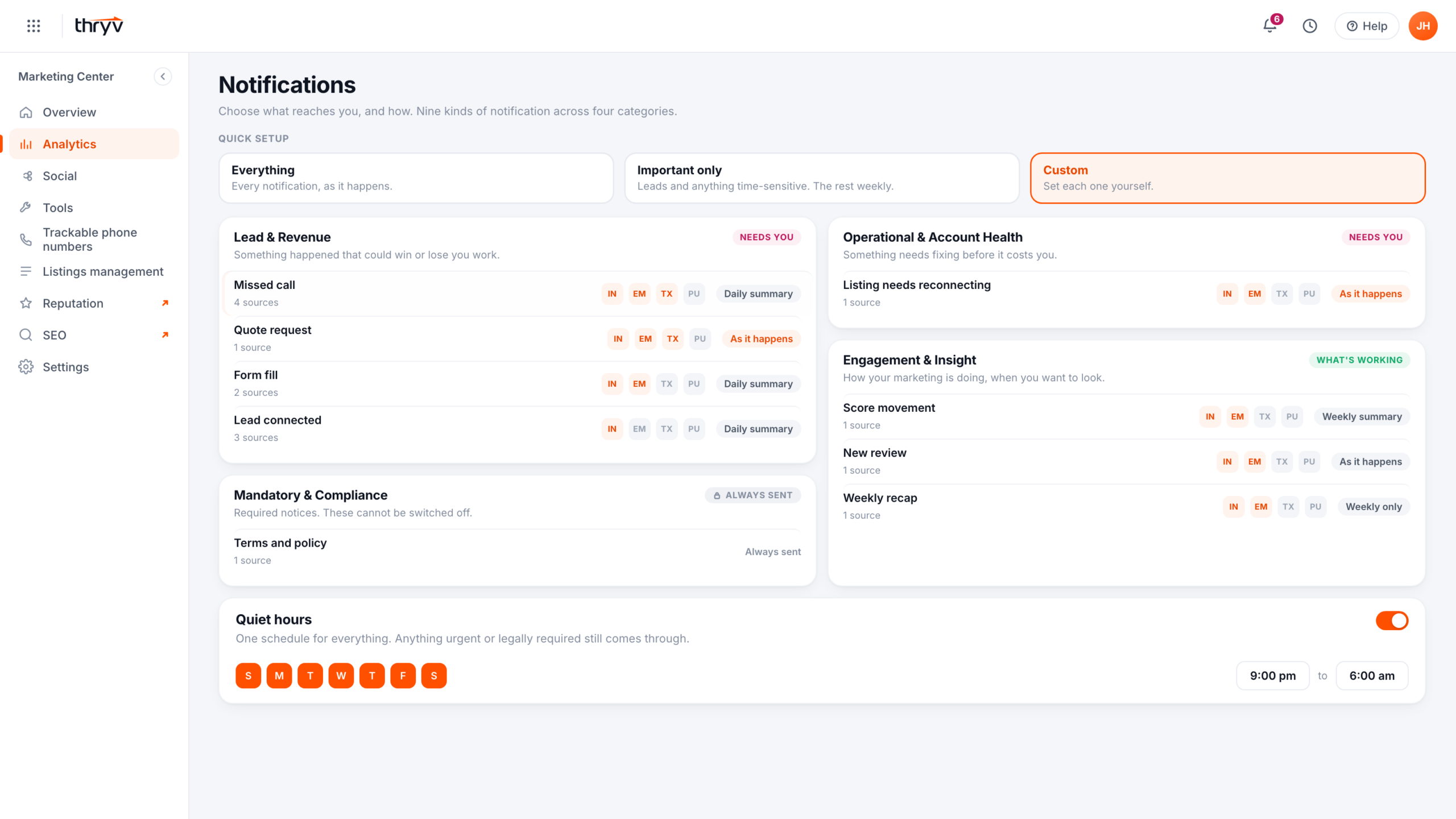
My alert model sorts nine types into four categories and keeps alerts that need the owner apart from good news. In my working build, all three places share one set of preferences.
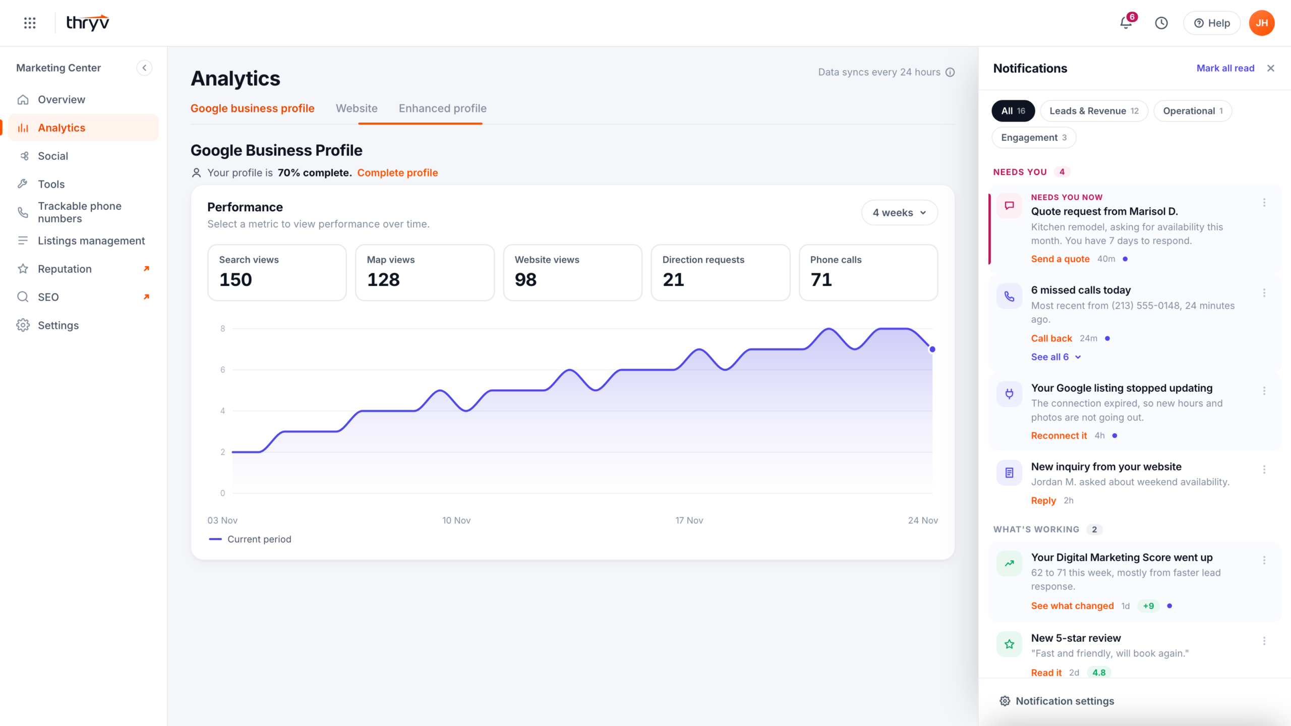
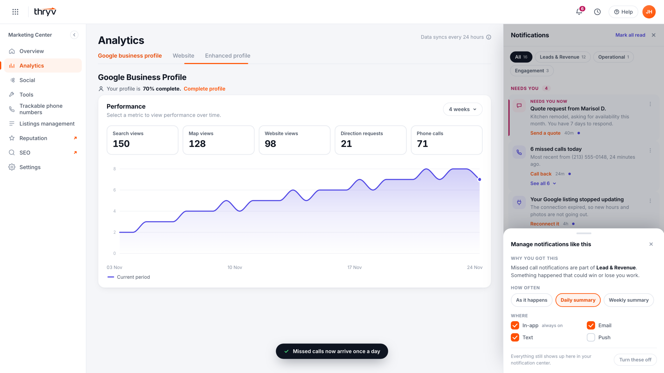
Repeated alerts fold into one row with an offer to get them once a day.
In my working build, a run of one type brings a prompt under it that offers a daily summary.
Interaction in a notification center. Six missed calls arrive as six rows, then roll up into one row, 6 missed calls today. A dashed prompt on that row asks, Getting a lot of these? Switch missed calls to a daily summary, with a Turn it down button. Pressing it turns the prompt into a confirmation, Missed calls now arrive once a day, the row gains a Daily summary tag, and every call still shows up in the notification center.
- Repeats roll into one row.
- The fix is offered on that row.
- One press sets a daily summary.
If I get three alerts about the same thing, I start ignoring them all.
More in the working build
- Low ratings are urgent. A 1- or 2-star review sits in Needs you and carries the urgent accent, and better ratings stay in What's working.
- Plain reasons. Every type says why it reached you, including calls the AI reviewed and flagged for a follow-up.
- Plain names. Rows name what the owner bought or uses, never a vendor.
- Mute for 7 days. A pause that sits between less and off.
- Weekly recap row. It says how many smaller updates it rolled up, so a quiet list does not read as broken.
- Unread badge. It counts unread only, caps at 9+, and never resets just because the panel opened.
The build
I built it in code so problems would show up early.
I reviewed the first prototype against the requirements, the strategy and the survey, and added research of my own. Then I built my own version in Claude Code, so every decision could be clicked through in real states.
With realistic data, good news disappeared from the bell.
The bell's peek showed the eight newest items. In a seeded account every recent item was a lead, so What's working never appeared and the two tiers collapsed into one list.
I changed the peek to five from Needs you and three from What's working, so good news always has a place.
A schematic of the bell's peek, before and after. Before, it showed the newest 8 items, and in a realistic account all 8 were leads, so the What's working tier showed 0 and the two tiers collapsed into one list. After, it showed 5 items from Needs you and 3 from What's working, so good news always has a place.
- Building. I made both prototypes, the working build and the walkthrough, in Claude Code. The walkthrough runs on one clock, so every video frame comes from that code.
- Checking. Running it in real states turned up at least five bugs, which I fixed in the same sessions.
- Comparing the documents. Claude read the requirements, the strategy, the tracker and the planning board side by side and listed where they disagreed, for me to settle.
- What stayed mine. The alert model, the design calls in both prototypes, the copy, what the audit meant for scope, and the handoff questions.
Other problems the build caught
- The four settings views each kept their own copy of the settings. A cadence set from an alert never showed in Settings. I moved every view onto one shared store, so a setting reads the same everywhere.
- I kept the seeded badge in single digits. A wall of 20-plus unread would push any test participant toward switching everything off.
- The phone view had no way back. It hid the only control that left it, so I put a way back to desktop outside the simulated device.
The audit
Only 3 of 10 lead sources were actually sending.
After the build, I found that the requirements, the planning board, the tracker and the first prototype each described a different system. I wrote down what was planned and what was live before going further.
Audit diagram. The planning board listed 11 lead triggers, all tagged Revenue, real time, email and MVP. Checked against the tracker, they were 4 active notification types with 10 sources, plus 1 canceled type. Missed call: 4 sources, 1 sending, 2 switched off, 1 unconfirmed. Form fill: 2 sources, 1 sending. Quote request: 1 source, sending, the only fully live type. Lead connected, answered calls the AI scored as strong leads: 3 sources, none sending. Potential lead: canceled, will not return. In all, 3 of 10 sources were sending, on one channel, email, and apart from the email's full opt-out, customers had no control in the product in the first phase.
And the first prototype folded three real types into one invented type, and modeled seven types the first phase did not cover.
With so little live, a design for control had to say which phase it was for. That became my second question at handoff.
Testing
The test I planned checks if owners understand what their settings will do.
I wasn't worried owners couldn't use a settings page. I was worried they'd misread what their settings do. The test did not run before I handed off.
Each participant would get one of three cells and the same question.
The working build could already put the control in one of three places. Every cell ends by asking, based on what you just set, what shows up tomorrow morning?
- AThe row menu
- BInline on a repeated alert
- CThe panel header
What came next
I handed it off with three questions only product could answer.
Requirements were still moving, so I left the working build as the reference and wrote up the questions for a review with product and content design.
- Is engineering building an inbox, or only a preference page? The design needed both.My call. Both. Preferences go in account settings, the inbox is the destination with the bell as a peek into it, and each alert keeps its deep link to its settings.
- Does the design target the first phase or the full model? The first phase's four types, or all of them.My call. Design for the full model so nothing has to be redone, and build the first phase's four types first.
- Do sources appear in settings? It is the biggest layout decision in the settings screen.My call. Settings start with the four alert types only, and sources come in once product decides how many to support.
The settings layout question
Question 03
Four rows, or four that open into ten.
4rows to scan
One row per type. Simple, but an owner cannot keep one source and mute another.Four rows that open into ten sources. Finer control, and a longer list to read.
The settings card for the Lead and Revenue category has four type rows, missed call, quote request, form fill and lead connected, each with channel and cadence controls. With sources shown, the four rows open into ten source rows, 14 rows in all.
For content design, I flagged that customer-facing names for every type and source were still an open, unscoped decision.
Where it stands · November 2026
Ready to build
I got the first phase ready to build, designed the full model behind it, and reviewed both with the PM and the content designer.
- Full modelNothing to redo later
- PrototypeA working build and its repo
- AuditWhat was actually sending
- HandoffDocumented phase by phase, where it stands now
I left Thryv in November 2026, and the work went to another designer.
- Handed over
- Full documentation of what was done, the decisions and what's next, laid out by phase
- The prototype and its repo
- A CLAUDE.md file with the project context
- My FigJam board from the working sessions, with flows, phases, open questions, alternative flows and proposed features
The test, ready to run. Owners pass if they can say what shows up tomorrow morning from what they just set.
Looking back
Building it in code showed problems a mockup would have hidden.
That is how I found the collapsed tiers in the bell and the settings views that disagreed.
Next time, I'd check what's live before I design.
I built my first version against the requirements, and only then checked what was actually sending.