Push Security · Campaign builder case study
Push Studio
Marketers make their own on-brand banners, and design signs off.
A proof of concept I designed and coded for Push Security's marketers, built on their design system.
- Role
- Lead UX/UI DesignerPush Studio, Push Security
- Assets it makes
- Social, email and webSocial posts, email headers and web banners
- What I built
- Working proof of conceptDesigned and coded
- Built on
- Push design systemBrand rules locked, only content changes
The problem
Every simple banner waited on design.
Marketers went through the normal Jira ticket process and waited for a designer to pick it up. The design team was small, and a lot of its time went to production-level work that pulled it away from larger projects.
A simple post took a few days to a couple of weeks.
It depended on the design team's bandwidth and priorities.
This is really slick. I'm always putting in tickets for a simple social post, and this would make it so much faster than going through design.
The 30-second read
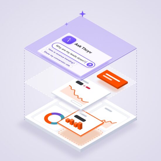
I built a tool where marketers make on-brand assets from the design system.
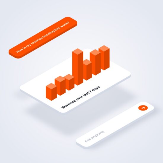
Fonts, colors and layout come from the brand kit. A marketer can pick a template or describe the post in one sentence and get three options to choose from.
One post becomes every channel size, and design reviews it before it goes out.
It was meant to let marketers skip the Jira ticket for a simple post, so the small design team could stay on larger projects.
My role: Lead UX/UI Designer. While I was working on the Push design system, I met with the design director and our motion designer, and we brainstormed how to make the design system easier for marketers to use for very small tasks. It was a group idea between the three of us. I took it and built on it, and I wrote the project scope and requirements myself while I built the proof of concept.
Walkthrough · 69 seconds
The walkthrough goes from a one-line prompt to a reviewed export, in eight chapters.
Tools I learned from
I studied how tools keep non-designers on brand.
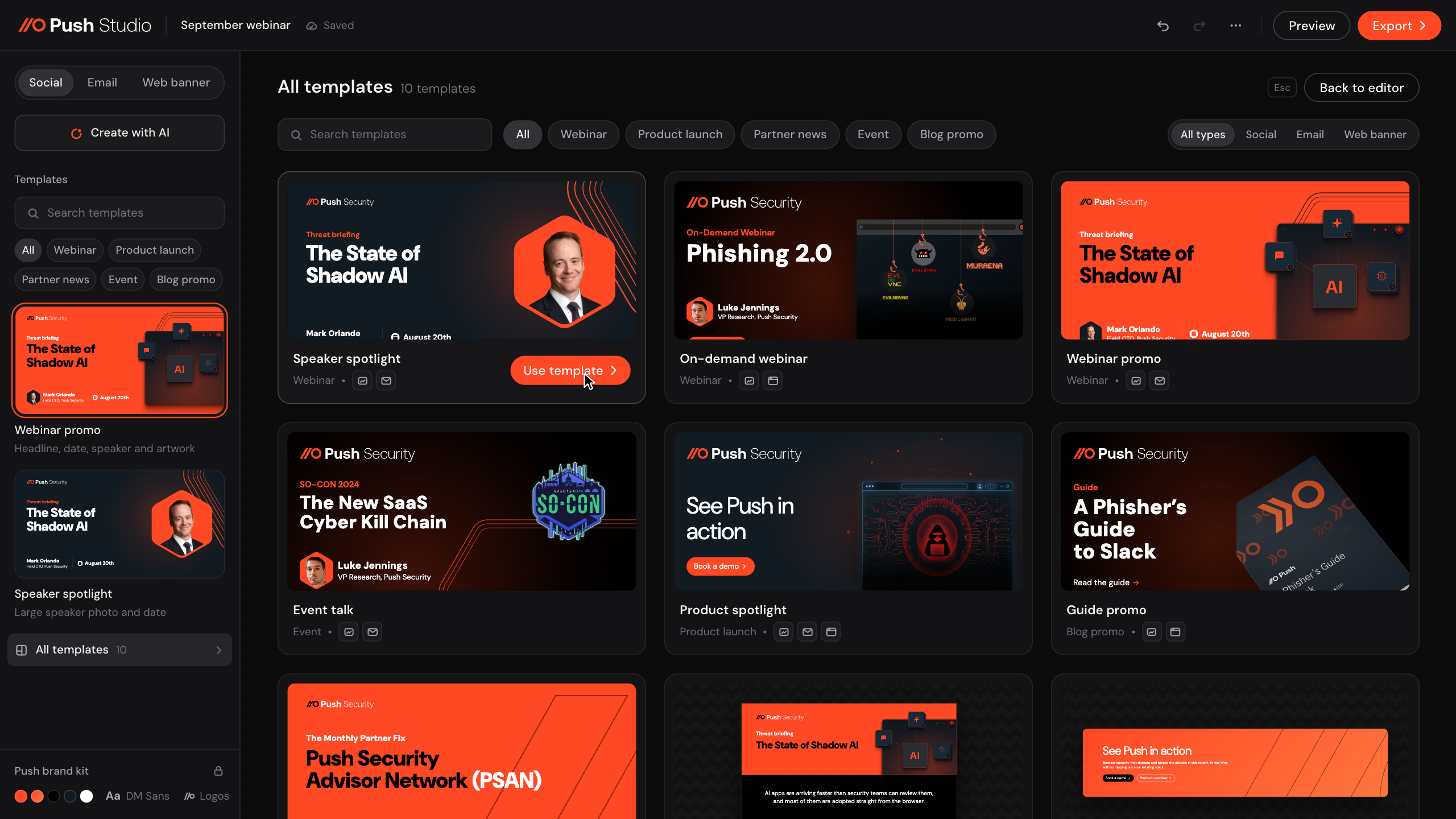
Every tool I looked at locked a template's brand parts and left the rest open.
Canva
Brand Kit keeps a team's logos, colors and fonts in one place, and admins can lock parts of a brand template so others edit only what's allowed.
- Logos, colors, fonts
- Template locks
 Adobe ExpressBrand kits
Adobe Express
Brand kits hold approved logos, colors and fonts, and locked templates keep key parts like the logo fixed while teams change the rest.
- Brand kits
- Locked elements
Figma Buzz
Designers publish brand templates and choose which parts are editable, and teams fill them in to make assets in bulk.
- Editable parts set
- Bulk create
Marq
Teams lock key parts of a template, like logos, fonts and colors, and share it so anyone can make a branded asset.
- Locked elements
- Shared templates
Decision 1 · The guardrails
I locked the brand rules so only content changes.
Locking them meant marketers couldn't step off brand, and design's sign-off could stay a quick review.
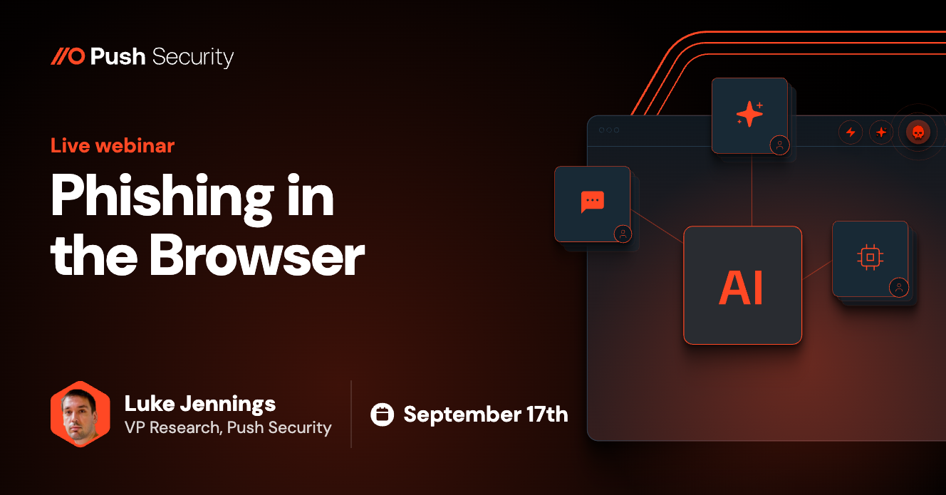
The LinkedIn post from the walkthrough, with its four editable layers.
Type and layout come from the brand.
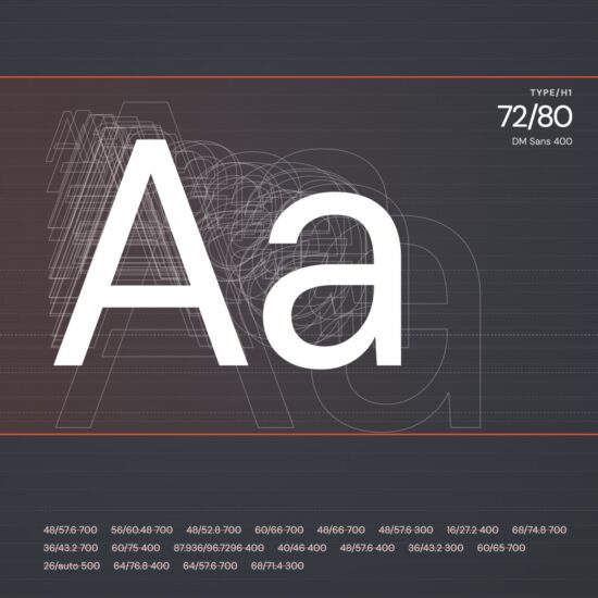
Every template uses DM Sans, with text sizes from the design system's type scale. Each template sets the layout for each size, so nothing can be dragged out of place, and each text layer shows a live count against its limit.
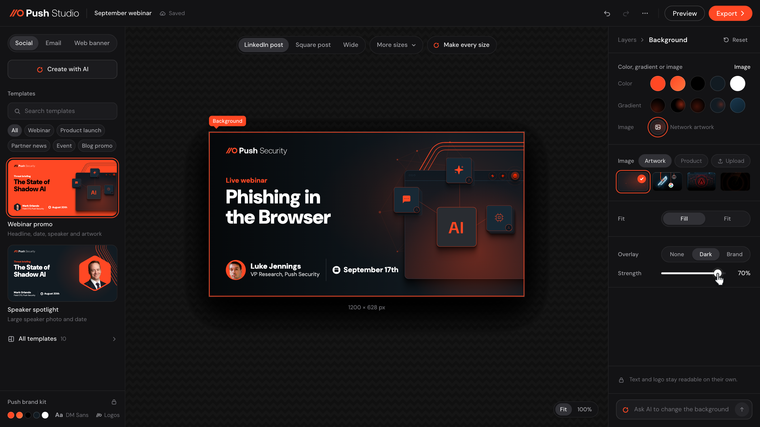
Colors come from 5 swatches and 5 gradients.
There is no open color picker. Button colors that wouldn't read are grayed out, and Push Studio picks the right Push logo for each background.
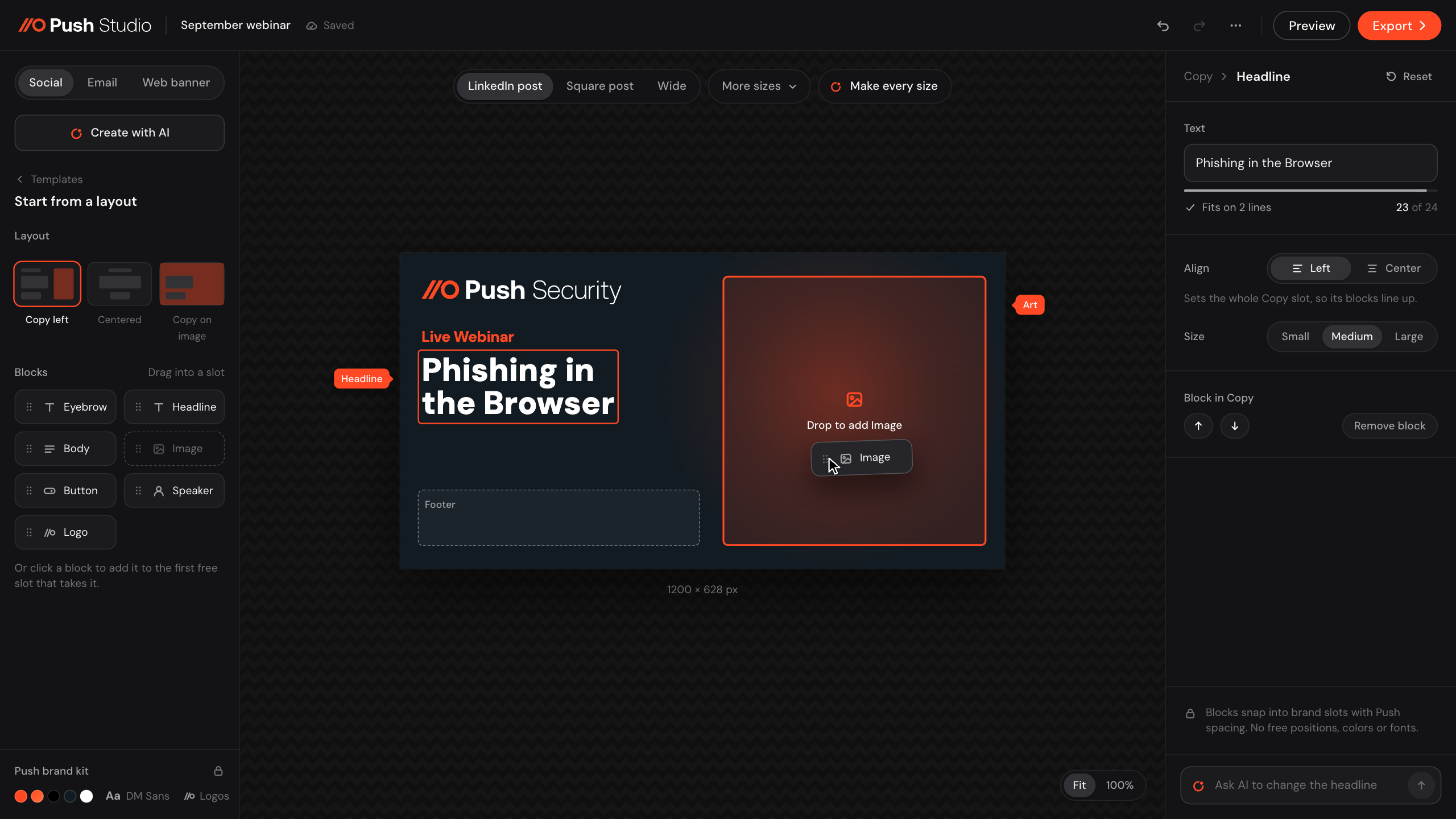
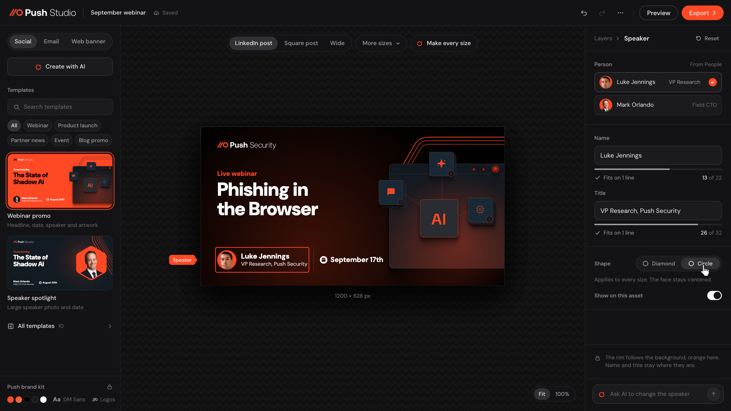
Every layer uses one inspector in the same order.
Click a headline, an image or the background, and the same panel opens with its controls in the same place. Editable areas show a soft tint and a name tag when you hover.
Decision 2 · Create with AI
AI follows the guardrails of the visual editor.
AI can only set what the inspector can set, so each option is an ordinary asset the marketer keeps editing by hand.
Three options.
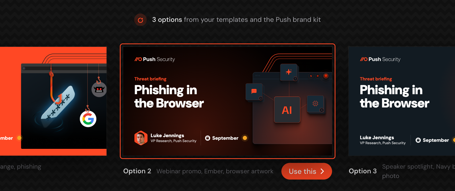
The options differ in template, background or image, and each one names what it used.
AI never invents facts.
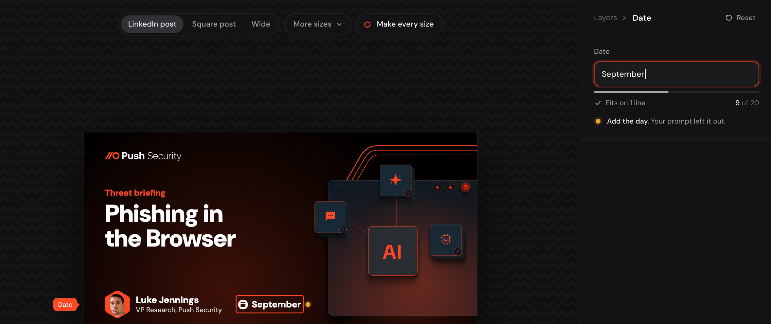
Dates, names and numbers come from the marketer or the library. If the prompt leaves one out, AI leaves that layer for them with an amber note, for example "Add the day".
Every change has a summary.
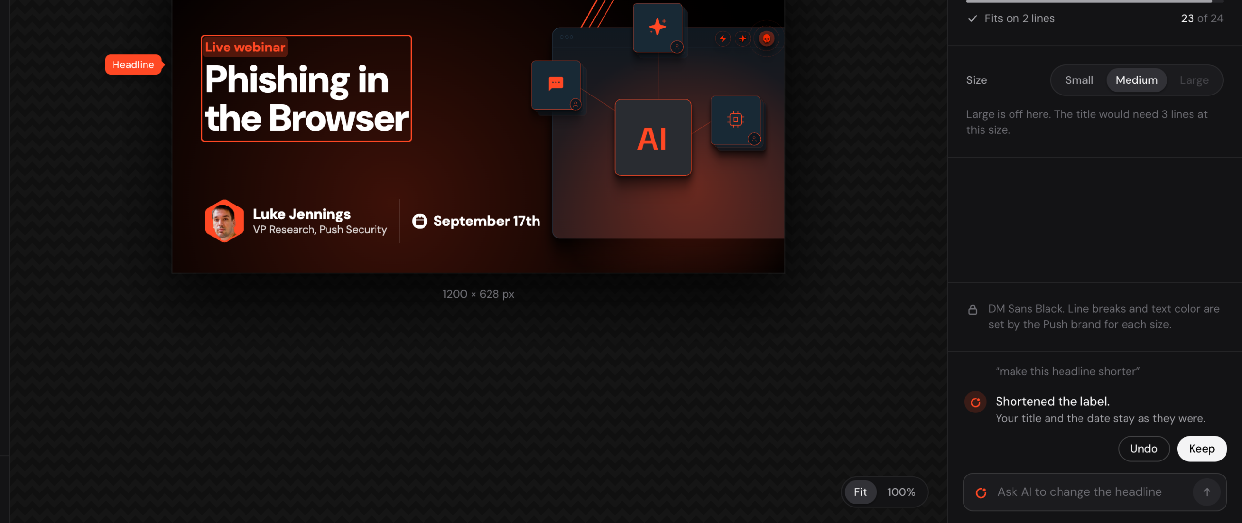
When a marketer asks AI to change a layer, a one-line summary of the change appears with Keep and Undo.
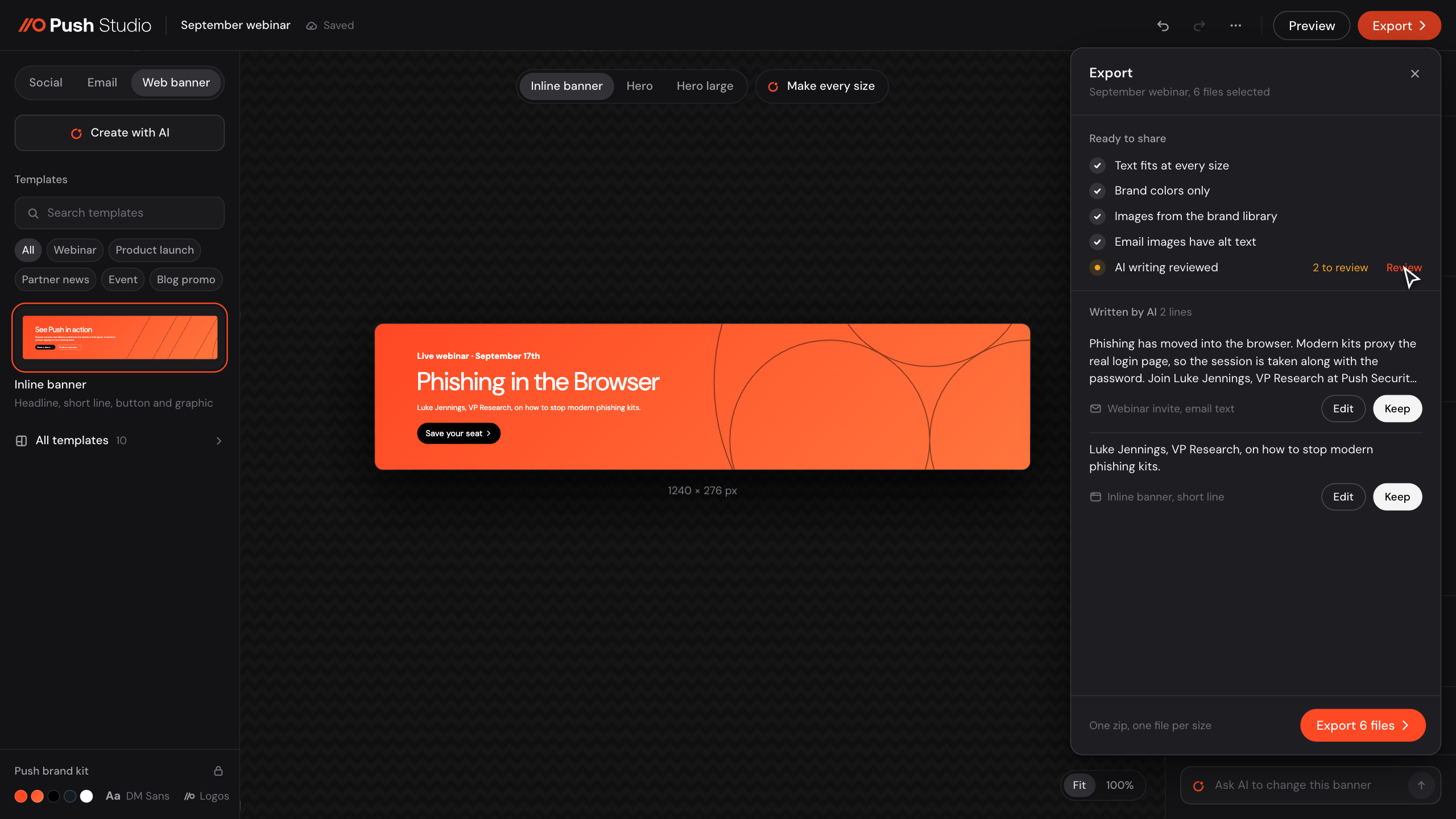
AI writing gets reviewed.
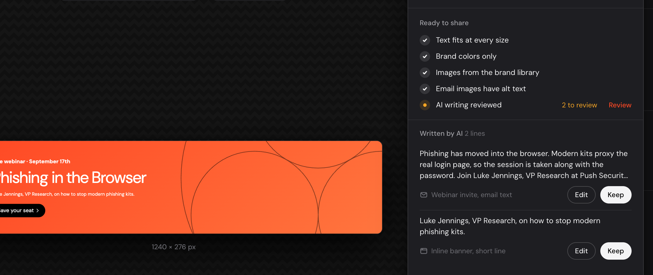
Lines AI wrote that nobody has seen yet carry a "Written by AI" tag, and the export check lists them for review.
AI copy follows the approved voice and tone.
When marketers type their own copy, voice and tone can easily drift, so here AI adds guardrails. Design still signs off on every asset, and that's a quick review.
Decision 3 · One post, every channel
One post covers every size without starting over.
A line that runs too long for its size turns amber with "Too long for this size".
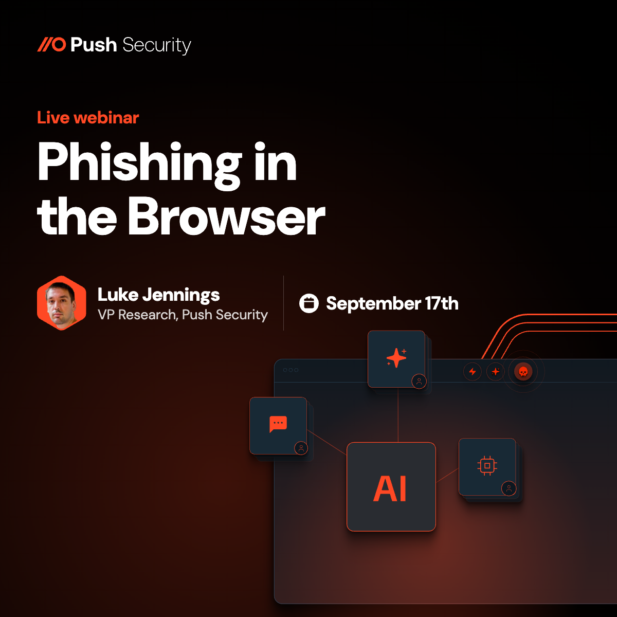
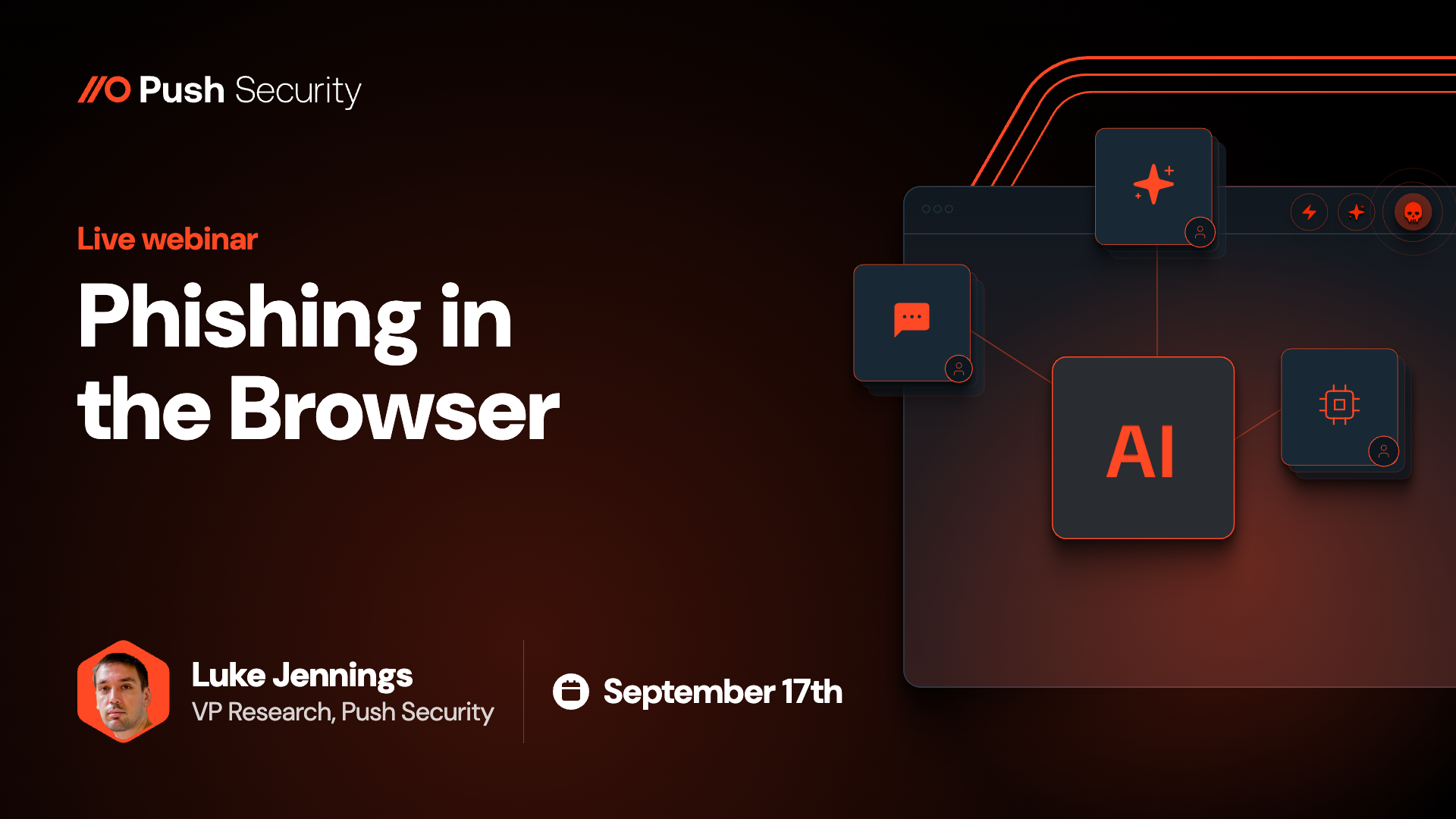
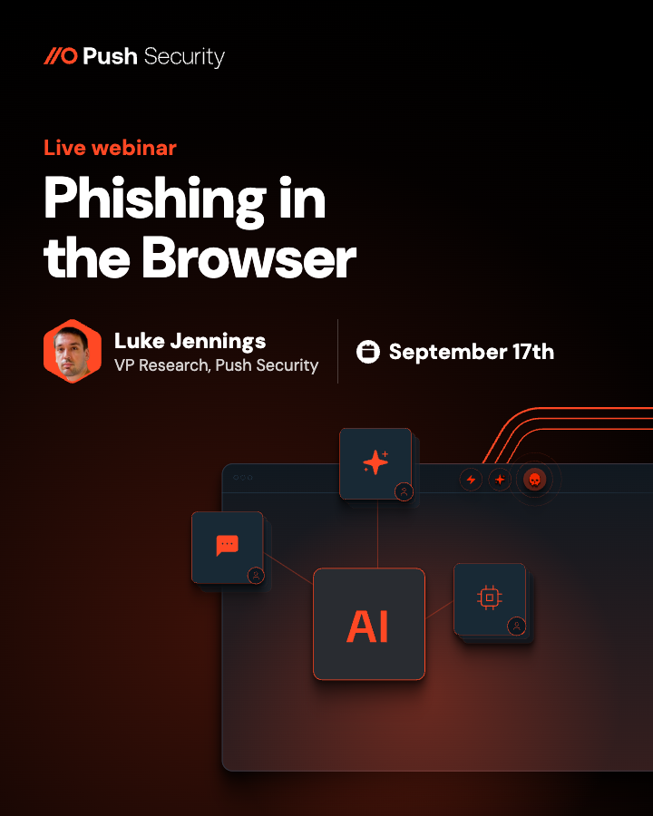
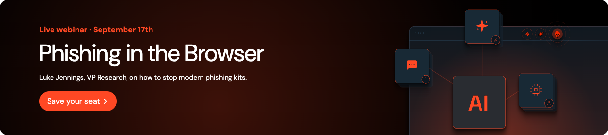
The artwork can animate once, then rest.
On an email header, the artwork can animate once with motion the design system already uses, then rest on the finished design. Outlook on Windows shows only the first frame, so I made the first frame the finished header. Only the artwork moves, and the copy stays a sharp still image.
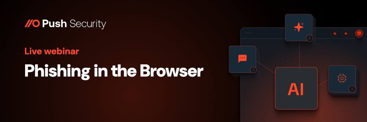
Text stays readable when the background changes.
Switch a white background to black, and the text and icons turn white or one of the approved lighter colors. A dark background image makes the text render in colors that read on it, and a lighter image switches it to black.
Testing
Internal testing feedback shaped what I built next.
I tested the proof of concept internally with 5 people, and their feedback shaped the next iterations, including adding an AI prompt that helps marketers create a banner and its options.
- A blank template option, which became Start from a layout.
- Save a design and pick it up later.
- Share a design internally with a link.
- Add an icon from an approved icon set.
- Text and icons that switch to a readable color when the background changes.
Product tour
The editor up close, in five parts.
Each one shows what a marketer can pick and what the brand sets.
Phase 2
One brief would become a campaign for review.
Create with AI makes one asset at a time. Phase 2 was the planned next step, an AI assistant for a whole campaign, with a person signing off before anything goes out.
- Brief to campaign.A marketer pastes a brief or an event page link, and one pass makes the posts in every size, the invite and reminder emails, a web banner and a follow-up.
- Brand and compliance review.Before sign-off, a review pass flags off-brand tone, weak contrast, claims that need a source, missing alt text and broken links, each with a one-click fix.
- Audience-aware variants.Each audience from customer data, like security leaders or IT teams, gets its own headline and image on the same template.
- Test sets with an approval summary.Two to four variants each change one thing, and the approver signs off on one page.
- Change the whole set by asking.One request, like "shorter headlines on the square sizes", applies across every size and channel, with a list of changes to keep or undo.
- Brand-made visuals and motion.New backgrounds come only from the design system's own glows, line art and network graphic, and any post can become a short video or an email GIF with the brand's motion presets.
How I used AI
- Planning. I used Claude to plan the build carefully, and I fed it all the documentation and files so the plan was robust and clear.
- Building. I built the working proof of concept with Claude Code, on the design system's token file. It let me iterate faster and build a more complete prototype.
- Exploring. Claude also let me step into the technical areas around design and try new ideas quickly. I move between it and Figma, and the two complement each other.
- Voice and tone. I fed Push's voice and tone documentation in during the build, so AI-written copy follows the approved voice and tone.
Looking back
I'd still build on the system and start smaller.
I kept marketers' choices small but made my first version too big.
Having the design system in place first worked.
The guardrails came from rules that were already decided. Push Studio was meant to give marketers a deliberately limited slice of the system's options, so they could make on-brand social and email assets quickly without getting overwhelmed or stepping off brand. Quick internal interviews showed me what marketers would want to do in a tool like this, and I did my own discovery and research into similar tools.
I'd start smaller and test the core idea with internal folks first.
I tried to boil the ocean with more advanced features before testing the overall proof of concept. We also tried letting users make page mockups with real design system components, and then we decided to focus on production-level assets with guardrails, so quick assets didn't need the whole design and Jira process.
Campaign builder · Push Security
Thanks for reading.
I took a brainstorm idea to a working proof of concept and planned the AI assistant that would come next.